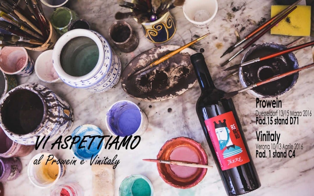
It is a little past midnight on a beautiful sunny Sunday where, for a change, I have been working all day! But before I fall asleep, I want to tell you about a lovely family that produces wines that are able to tell the story of my homeland, Romagna. TreRè has just completed its image makeover, which began in October with the new website that I did, and has now arrived, where the new labels were presented at Prowein in Dusseldorf on 13 March and will be presented in Italy at Vinitaly next week!
By the way, I've almost finished creating my map of wineries you absolutely cannot miss at Vinitaly: 20 regions, 60 wineries, 180 tastings! I'll publish it on Friday... so be sure not to miss it 😉
I particularly love the TreRè site because I consider it my best work. I know I shouldn't say this because I have so many clients for whom I have always worked at my best... but here I have really given something more, also thanks to Max and Morena's availability, their trust in me and above all the excellent material to work with: this company is really a gem!
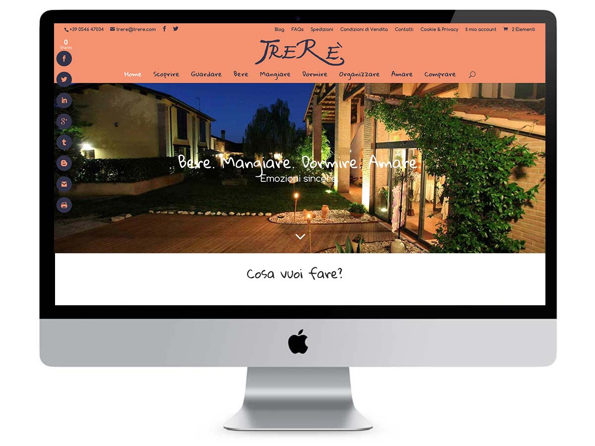
When I took over the job, the website was very slow and heavy, but above all, it had been divided into 3 sub-domains with 3 different CMS installations and this was making it so heavy that it was really difficult to load, especially for less performing connections! However, the biggest penalty was not this, but its dispersiveness: I, who am anything but the average user, was struggling to find the information I needed. So many times I have seen that my fellow web designers or other web agencies do not care at all about website usability, but above all they forget that the user landing on any website is looking for a quick and free answer to a question he is asking himself. That is why creating an easy and straightforward website is always my priority.
Here I have ventured a little bit with the menu items, which are definitely unusual! Instead of the usual 'About us, wines, photogallery, rooms, shop, events and restaurant' just to mention rather banal menu items that you will find in the 95% of websites, I thought of naming them with verbs in the present infinitive tense that respond to actions you can do within the site or with TreRè products.
"Who we are' becomes 'Discover'.
"Photogallery' or 'Gallery' or 'Photo' becomes 'Look'.
'Wines' becomes 'Drinking'.
'Restaurant' becomes 'Eating'.
'Rooms' becomes 'Sleeping'.
"Events' becomes 'Organising'.
'Marriage' becomes 'Loving'.
'Shop' becomes 'Buy'.
This choice is not only a beautiful grammatical and phonetic consistency, but also makes using the site really intuitive! For the colours I chose a blue close to that of the original coat of arms and matched it with an orange that Max hates, but Morena and I like 😀 and it complements the blue, enhances it, whets the appetite and invites action. And then the red of the labels looks great on printed graphics, but on the web it was an eyesore 😉 But I invite you to discover the new TreRè site by clicking on the image below!
As for the labels, the work was done by the Visual Designer Jona Sbarzaglia which, apart from the .biz site (never, never register a .biz domain! This is because this extension is used by ill-intentioned people to do spam and phishing etc. and is consequently penalised by all search engines and e-mail providers) is really on the ball! He has perfectly captured the quintessence of the TreRè family and the tradition it embodies in the heart of Romagna.
The art of wine. The restyling of Trerè wine labels has new names and faces. Colours and strokes are decisive, strong, iconographic and immediate. To give a material impact that aims to recognise the wine's value of being itself the fruit of an art. An art that comes from the earth and passes through the skilful and passionate work of those who produce this wine: a family from Faenza that for three generations has pursued a quest for excellence in craftsmanship. Hence the choice of a distinctive and recognisable style that immediately speaks of art, and therefore also of the art of wine. To do this with efficacy, and open the way to identification, tradition is illustrated with the clarity of simplicity: the roots remain, the codes change. Through a restyling also aimed at exalting the passion and taste for what one is, while speaking of artisanal creativity also to a young and new audience. The new labels bear Romagna names that echo a consolidated tradition, resonating in a visual context where the disorienting immediacy of the stroke increases recognisability and character. To the benefit of impactful, stronger and more distinctive visibility. The straightforward stroke is the most authentic way of narrating a passion that has become art.
Jona Sbarzaglia
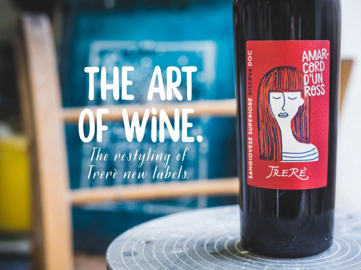
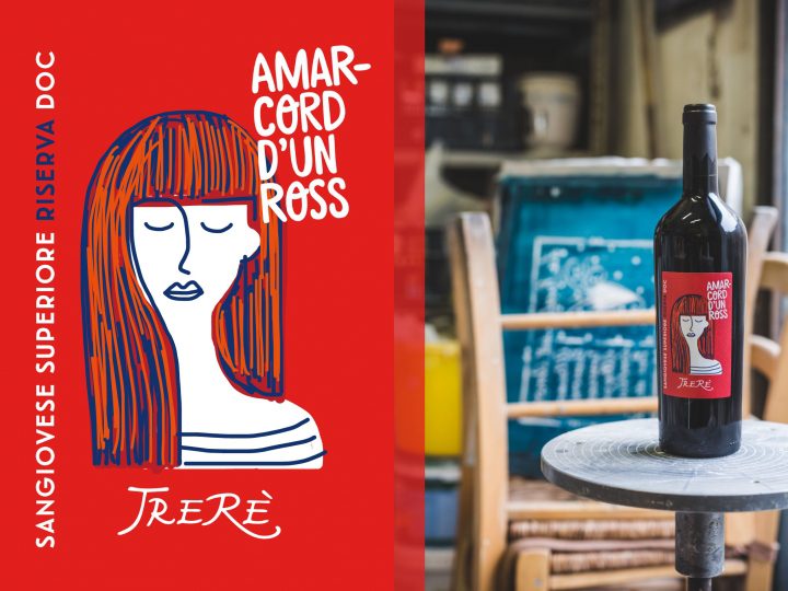
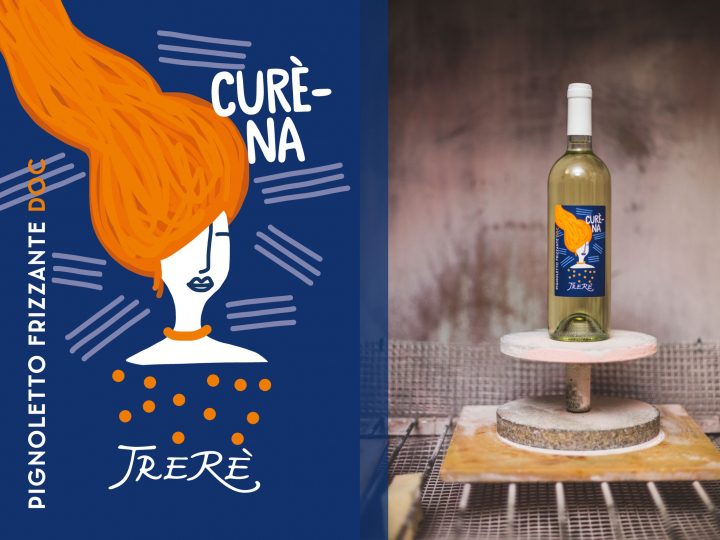

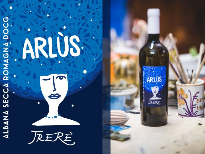
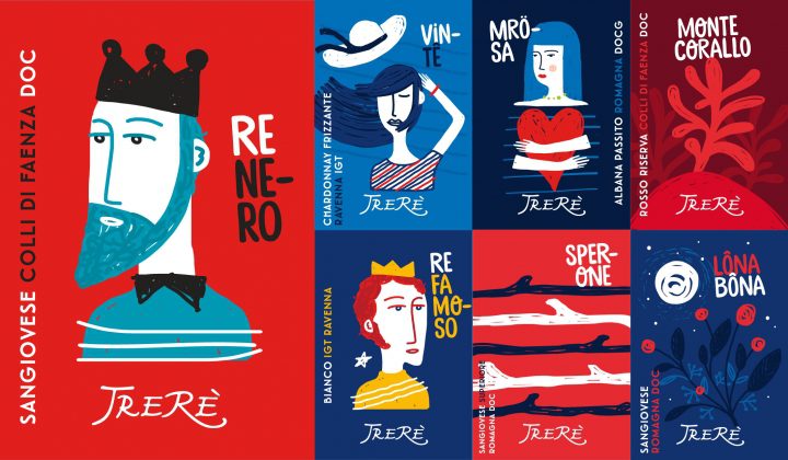
Jona to me is a true artist and these labels I will never get tired of saying how beautiful they are! Bravo, bravo, bravo! I am honoured to have contributed to this renewal with him!
The farmhouse? Delicious, especially for a shabby chic ceremony or a country wedding.
The restaurant? Tradition and innovation come together for simple but really tasty cuisine with quality ingredients!
Wines? Taste them at Vinitaly! Then I'll tell you the rest...
See you soon,
Chiara
P.S. I greet you with this beautiful family picture, with Morena and Max: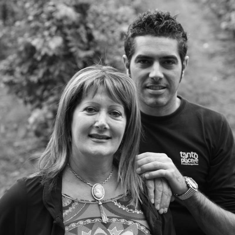
Are you familiar with the TreRè farm? Have you ever visited the farm or tasted its wines? Leave me a comment... 😉