Of course, the Sommelier is the creator of the wine list while the Chef is the creator of the restaurant menuHowever, in order for the restaurant menu to be excellent, Sommelier and Chef must work together to create the perfect menu! Some may argue that not all restaurants have a quality Chef and even fewer have a Sommelier in the dining room, but the restaurant that aspires to be in the guides for the excellence of its cuisine cannot have a menu built by the Chef alone.
The ideal restaurant menu is the result of the collaboration of many different heads and is never the sad glorification of the chef's ego! The restaurant menu MUST be designed to satisfy the end customer. Sterile quests for innovation unsupported by a careful analysis of the clientele, the food cost and the final cost of the dish inevitably lead to failure.
I know, I know: TV has accustomed us to chefs with exaggerated personalities who make piles of money, but the job of chef is the last one I would wish on my son: a good chef has no hours or days and lives in his kitchen and it takes a strong motivation and a great head to have results that justify and satisfy such a life! Not everyone is cut out for it, regardless of study or ability, and for those it is better to chat about cooking or manage small events or evenings at home!
In this guide I'll tell you the 10 steps to build the perfect menu, from ingredient selection to cost to graphics and choice of menu holder, but first... let's explore the different types of restaurant menus!
Do you want to prepare for the sommelier exam in half the time?
Would you like to pass the AIS examination at the first time and make a good impression even if you work and have little time?
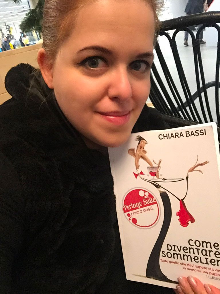
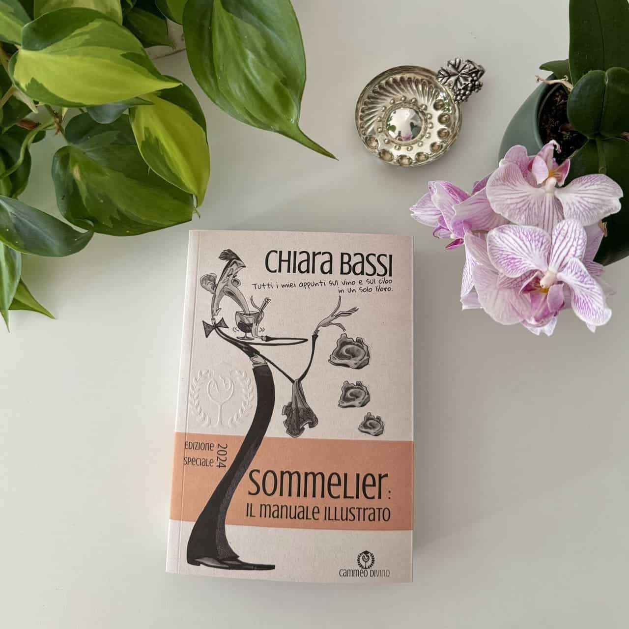
Even before I tell you the questions, I want to remind you that I have just written a book that will surely be useful to you and contains all my notes on wine. It is entitled "How to become a sommelier: Everything you need to know about wine in less than 300 pages'. The manual is designed for all aspiring sommeliers, but is very useful also for 'already sommeliers' who want to brush up or for restaurateurs who want to quickly train their staff with a 'compact' but effective preparation... among other things you will also find a whole chapter on managing your wine cellar and the rules for selling more bottles of wine and especially for selling the bottles that make you the most money! The great thing is that it's exactly the same size and weight as your iPad and contains all the essentials about wine... and then some! So you can really take it everywhere, I for example in this photo was browsing while waiting my turn at Ikea 💪
.
A banquet menu
Some restaurants base most of their income on organising banquets for ceremonies or corporate events. The menu design of a banquet is completely different from that of an à la carte menu because the type of dishes and their order are established in advance by agreement between the chef and the customer. The restaurant's task is not to disillusion the customer's expectations, but rather to always do that something more to surprise him and build his loyalty: if the customer is satisfied, his guests will also be potential customers. This something extra is to be considered a very low-cost, high-yield advertising investment for the restaurant: the restaurateur will never be as certain of reaching his target with targeted advertising as in this case. What can be done? Let's imagine it is a wedding banquet, a very welcome surprise can certainly be to prepare a small corner with an extra aperitif, telling the bride and groom that it is a gift from the house. And if you choose poor ingredients worked with the skill of the chef, success is assured (and the expense contained!).
A banquet menu can be very simple and comprise a single starter, a first course, a main course and a single dessert with matching wines indicated at the bottom of the page or, better still, immediately below the dish. This type of menu, suitable for informal occasions, can be considered a starting proposal for a larger menu, enriched with numerous courses, suitable for really important lunches or dinners.
The 10 rules written at the bottom of the page also apply to this type of menu, especially those of presentation: the more important the banquet, the more attention must be paid to bringing out an aesthetically pleasing menu.
.
The theme menu
The theme menu is proposed by some restaurants in particular seasons or days of the year, to highlight seasonal ingredients such as pumpkin, truffles... and is usually a menu that is added to or replaces the à la carte menu. Another way to interpret the themed menu is to create a special evening dedicated to ethnic cuisine, such as Spanish paella or Portuguese cataplana. Other successful theme menu evenings offer medieval cuisine with dishes from the period, provided the atmosphere of the historical period inspired is recreated in the restaurant. Nothing is more embarrassing than savouring a Roman dish while eating properly with your hands in an ultra-refined establishment without due preparation of the ambience or mise en place! A themed menu can also be dedicated to a particular ingredient, such as kobe meat. In this case, the theme menu always complements the restaurant's classic à la carte menu.
As a Sommelier, I love themed menus built around a wine: imagine, for example, choosing a Metodo Classico wine and pairing the same wine with a different dish from starter to dessert. A nice challenge for the chef, a low overhead for the restaurant that works on a single label and can well managing the cellar (especially if he chooses the right wine) and a surprising result for the end customer!
.
The Tasting Menu
The tasting menu is a variant of the fixed price menu. There are 2 types of tasting menus: the one with several courses consisting of samples and the one with a limited number of the most significant or well-liked or traditional courses of that restaurant. Personally, I like both! In the first one, the customer is given the opportunity to do numerous tastings and the Chef's skills are enhanced, while in the second one, local specialities are favoured. The Sommelier, especially in the first case, has to study the best pairings for more than one course, reducing the selection of wines in order to rotate the bottles correctly. The choices should always be limited to a maximum of 4 wines, including aperitif and dessert wines. The type of wines and their price vary according to the importance and price of the proposed tasting menu. I personally recommend always creating a tasting menu and, separately for an additional price, the wine pairing proposed by the sommelier. This will allow the customer to choose whether to trust the sommelier's skill, or to personally identify the bottle or bottles of wine they prefer to accompany their meal.
.
The fixed price menu
Unfortunately, in Italy this type of menu is strictly for tourism or business lunches. The fixed price menu has here the objective of optimising the work of the kitchen and giving the customer the possibility of eating a complete meal at a very economical price. In France, on the other hand, I have seen that this is not the case at all: in restaurants there are fixed price menus with various price ranges and the customer can compose his menu by choosing the dishes he prefers from those included in his price range by the restaurateur. For example, at the last restaurant we went to in Arles, you could choose between a fixed-price menu at 28 € or 35 € and, depending on your choice, the type of dishes offered varied. Personally, I find this a very apt choice for both the restaurant and the customer: for the former, the possibility of playing with the proposals to optimise his cuisine and the possibility of making a correct estimate of minimum takings, for the latter, it takes away the stress of thinking about the price of the meal because this is already established in advance. How we ate I will tell you in the next episode of the #WineDiary, in the meantime enjoy Porquerolles: the fascinating wines of la Ila de Hyéres in Provence ???!
Ah, if the fixed-price menu also includes wine pairings, the sommelier has the opportunity to sell wines of which he has plenty in his cellar but which may have some long-term storage problems. Here again I always recommend making two different proposals, one with just the menu and one that also includes wines!
.
The à la carte menu
Here I end the academic part and really put my own spin on it. The layout of this menu is standard, and in Italy you always start with the antipasti, followed by the first and second courses, any cheese selections and finally the desserts. The menu must contain the allergens next to each dish, but what are the 10 commandments to make it special?
1. Length, incipt and format
[Tweet ""He who drinks only water has a secret to hide." C.Baudelaire"].
On the first page write one or two sentences identifying the restaurant, without (mercifully) writing the whole story. Another nice idea is to write quotations on food and wineespecially romantic or fun. The important thing is not to overdo it and not to draw up very long menus that bore and confuse. If you want your guests to read, leave some books in the room. (Does anyone really read a book while waiting to eat?). I personally like menus that are 2 pages long, one on the right and one on the left: I don't get confused, I don't lose the page and I have everything in sight. It is also good for the restaurant in terms of management. Also on the 2 pages are the dessert and cheese menus and a selection of dessert wines by the glass or bottle from the restaurant to go with them (it is much easier to sell a pairing this way!). Avoid the photo menu like the plague: the first thing I think is that I've walked into a tourist trap and run away, just like when I see the menu with the plastic bags!
2. The number of courses
A well-executed menu offers the right amount of choices. Too many choices make one think of food that is not fresh or cheap and, at the same time, confusing. Too few choices... well what could be worse than a restaurant that offers no alternatives? Rather it is up to the skill of the chef to play with the fresh ingredients, perhaps repeating some of them between dishes. The right proportion? If we are not a restaurant specialising in meat or fish, we always give 3/4 meat alternatives, 3/4 fish alternatives and 2/3 vegetarian alternatives! Remember that vegetarian alternatives, if well thought out, please everyone: just think of a dish of pumpkin cappellacci on a pecorino cheese fondue with maybe a grating of truffle on top! Do you know a carnivore who wouldn't eat it? 😉
3. The composition of the menu
The first dish on the menu must have the lowest price and the last dish must have the highest price. And this must apply to everything from the starter to dessert. If as a second course the restaurant puts something extremely convenient for it in terms of profit margin, and very convenient for the customer in terms of palatability, it is easy for the choice to fall on the second option. Why? (Almost) no one likes to be a cheapskate.
4. Names of dishes
When you invent the name of the dish, don't be too original: people like to understand what they are eating and if your wait staff is not well prepared there is a risk of making a big impression. Instead, I find it very catchy to indicate quality suppliers, sought-after products such as PDO, Slow Food or other presidia. When writing the name of the dish graphically avoid 'all caps', gothic or unreadable fonts and prefer a minimal and clear style. One more emphasis on the name: to increase the perceived value, use the products themselves! For example, instead of writing 'pork tenderloin with vinegar and vegetables', write: 'Filet of Mora Romagnola with elixir of traditional Reggio Emilia balsamic vinegar aged 25 years on a bed of our vegetable garden'. I am sure that with the last wording the dish will taste better and may even cost a few euros more! 😉
5. Prices
the price must be written in the same font, preferably only the number (for the currency maybe write 'price in €'). Always use a whole number, without commas. Avoid prices such as 9.99 €, which look like a supermarket sale and already indicate low quality. Graphically, prices should always be written lined up to the right to give a sense of order, possibly in a lighter and more discreet tone than the colour of the plates. For example, if you write the plate in black, write the price in the same font, in the same size, but use the colour grey.
6. Aesthetics & Graphics
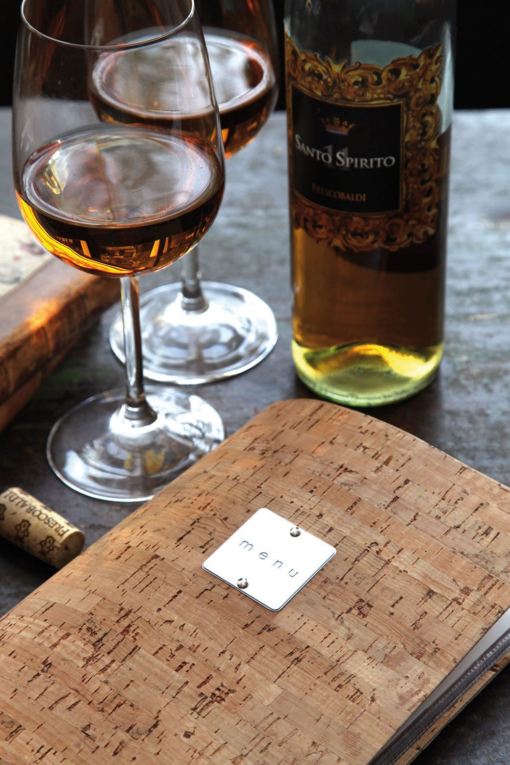
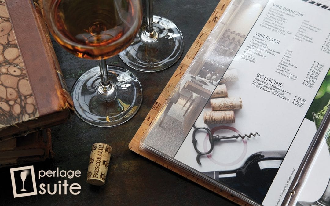
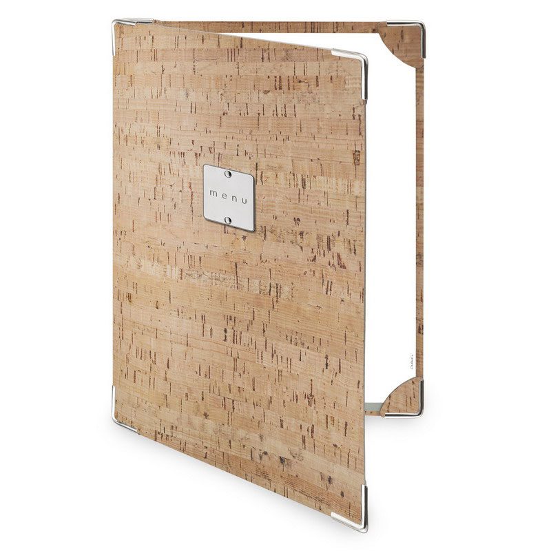
The aesthetic choice of the menu is very important and there is nothing sadder than seeing menus with transparent envelopes and papers stuffed inside. If this happens to me, I change restaurants immediately. For me, this is the first indication of how I am going to eat... As for the shape, I really like the A4 album format, i.e. horizontal. Another shape I love is the half A4 vertical, in cork, especially for the wine list. For the menu of the day, I find papyrus tucked into a shape that contains and embellishes it perfect and practical.
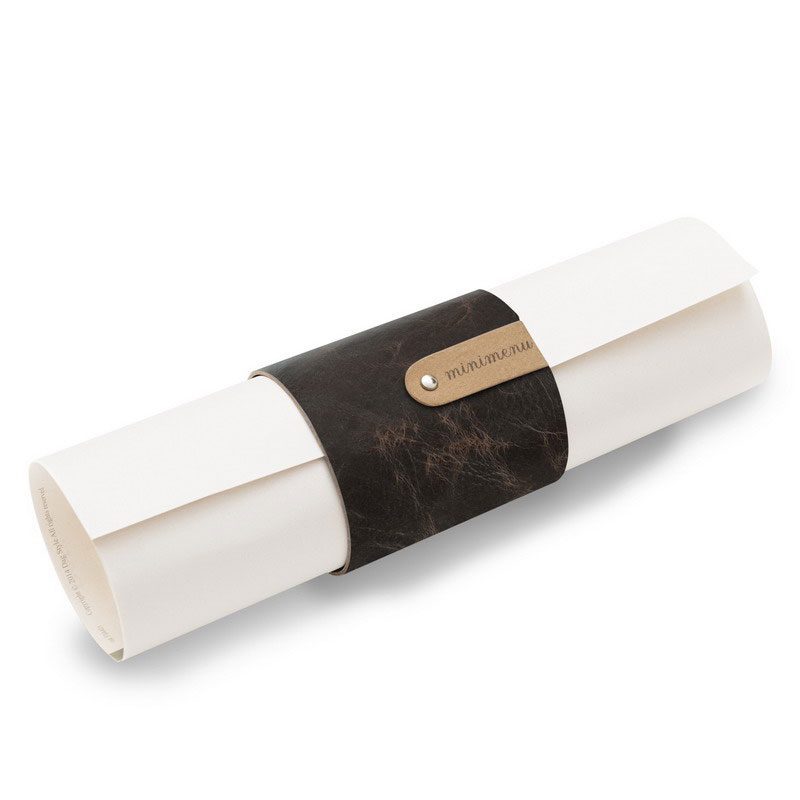
But if you want to do your customer good... always use a simple 2-panel so that they always have the overview. Choose a nice canvas paper, chalk tintoretto, straw paper... in line with the style of the restaurant and, if you have a nice handwriting, write your menu by hand (or have someone write it for you!) and then make high quality photocopies: success is assured and running costs are very minimal!
7. A restaurateur is not a graphic designer!
I know, many restaurateurs are absolutely convinced that they are also graphic designers. Others even consider a graphic designer an unnecessary cost. And so it is that we poor customers find ourselves menus with Arial or Times New Romans fonts, Brush and other things of dubious taste. The bottom however we touch with errors of all kinds, and marker corrections on top (when someone has noticed). As they say? There is no second chance to make a first impression. If I'm looking at a menu outside a restaurant and I see a typo corrected in pen, I don't even go in: how can I expect them to pay attention to cooking and service if they haven't paid attention to something so basic? Composing a menu is a great aesthetic endeavour, which must be carried out with great professionalism by qualified staff (e.g. me 😉 ) capable of making a great first impression! Everything must be taken care of in detail, from the layout to the choice of paper. The composition rules must be respected. And above all, before you put it in print, read it even 10 times!
8. Beware of the proper names of a dish or preparation
As the very kind Giancarlo Agostinelli pointed out to me on the Sommelier Facebook group, pay attention to how you write the names of dishes or preparations. For example, if you offer the famous 'costoletta alla Milanese' in your restaurant, put the 's' before the 't'! Cotoletta is a French word left by Napoleon. The 'Costoletta alla milanese' (from the resolution of 17 March 2008 'Recognition De.Co. ai prodotti gastronomici tradizionali milanesi) is a preparation that has been talked about since 1134, but was first codified in Giuseppe Sorbiatti's Modern Gastronomy in 1855: 'thinly prepare six veal cutlets with grace, dip them in beaten egg, then baste them with bread, fry them slowly on one side over a low heat, turn them over, salt them, and after two minutes serve them on a plate sprinkled with their butter and lemon on the side'.
This is to say that if you propose a traditional preparation from your city, take care to spell it correctly and prepare it properly! And if you are from Romagna, be sure to spell it 'Pizza' not 'Pisza' 😉
I sincerely thank Giancarlo Agostinelli for teaching me this.
9. Theme dinners, Festivities, Special evenings
In such cases, many restaurants adopt a single menu, often printed with the 'home' printer on 80 gram paper. There, when I see these things, I feel sincere pity. Please, I beg and plead with you: at least use 140 gram paper and clean your printer heads before doing this! Or better yet, go to a photographer in your town (they always have a good printer in the shop) and print them on quality paper: it only takes a few euros to make a good impression!
10. GOLDEN RULE OF THE PERFECT MENU
Menu design, type of dishes, internal graphics and prices must always be aligned with the style and target audience of the venue.
And this chapter concludes part 1 of my guide 'The World of the Sommelier'. Here are all the paragraphs:
- The World of the Sommelier: : the figure of the sommelier, requirements to become a sommelier, ais or fisar, exam questions, cellar management, sommelier tools, the wine list, wine service.
- Cellar managementideal environment, bottle layout, wine cellar of the day and wine cabinets, procurement and cellar management, purchasing and stock rotation, wine sales, sales price.
- The customer is (almost) always righthow to deal with customers (restaurant, wine bar, wine shop, large-scale retail trade)
- Sommelier Tools: corkscrew, wine basket, decanter, bucket, glacette, wine thermometer, cork stopper, wine trolley
- Wine service: from cellar to table, bottle presentation, important bottle presentation, opening the bottle, decanting, table service, precedence
- MenuMenu setting, à la carte menu, banquet menu, theme menu, tasting menu, fixed price menu.
I know that courses to become a sommelier start these days all over Italy, good luck to you all!
See you soon,
Chiara
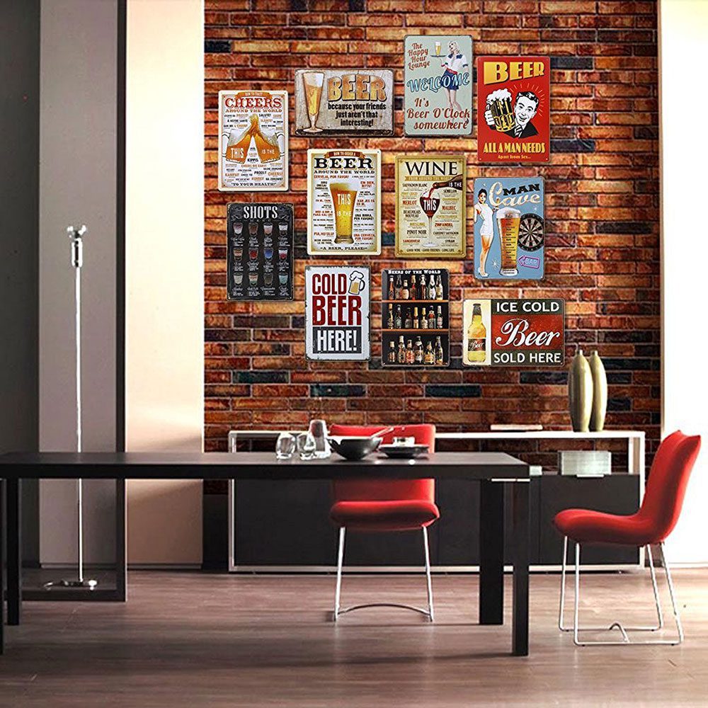
Speaking of menus... I just ordered these two posters to decorate my house on Amazon... I love them! It's very vintage and a bit industrial like the style of my house... do you like them? For now I've ordered Wine, Cheers and Shots... I'm waiting for them to arrive and then trying to figure out where to put them and if I can get more! 😉
Many thanks to Valentina of Dag Style for the photographs with which I have graced this article... and for their beautiful natural cork menus, which I find perfect for any wine cellar, wine shop or wine bar (but they also have many other very beautiful ones, have a look at their website 😉 )

